

Role: Lead UX/UI Designer | 2017 → 2019
Barclays | Margin Trading Application
Responsibilities:
Design of user flows, wireframes, high-fidelity mockups, and prototypes • Creation of an Atomic-Design-based design system to unify the product ecosystem.
Context:
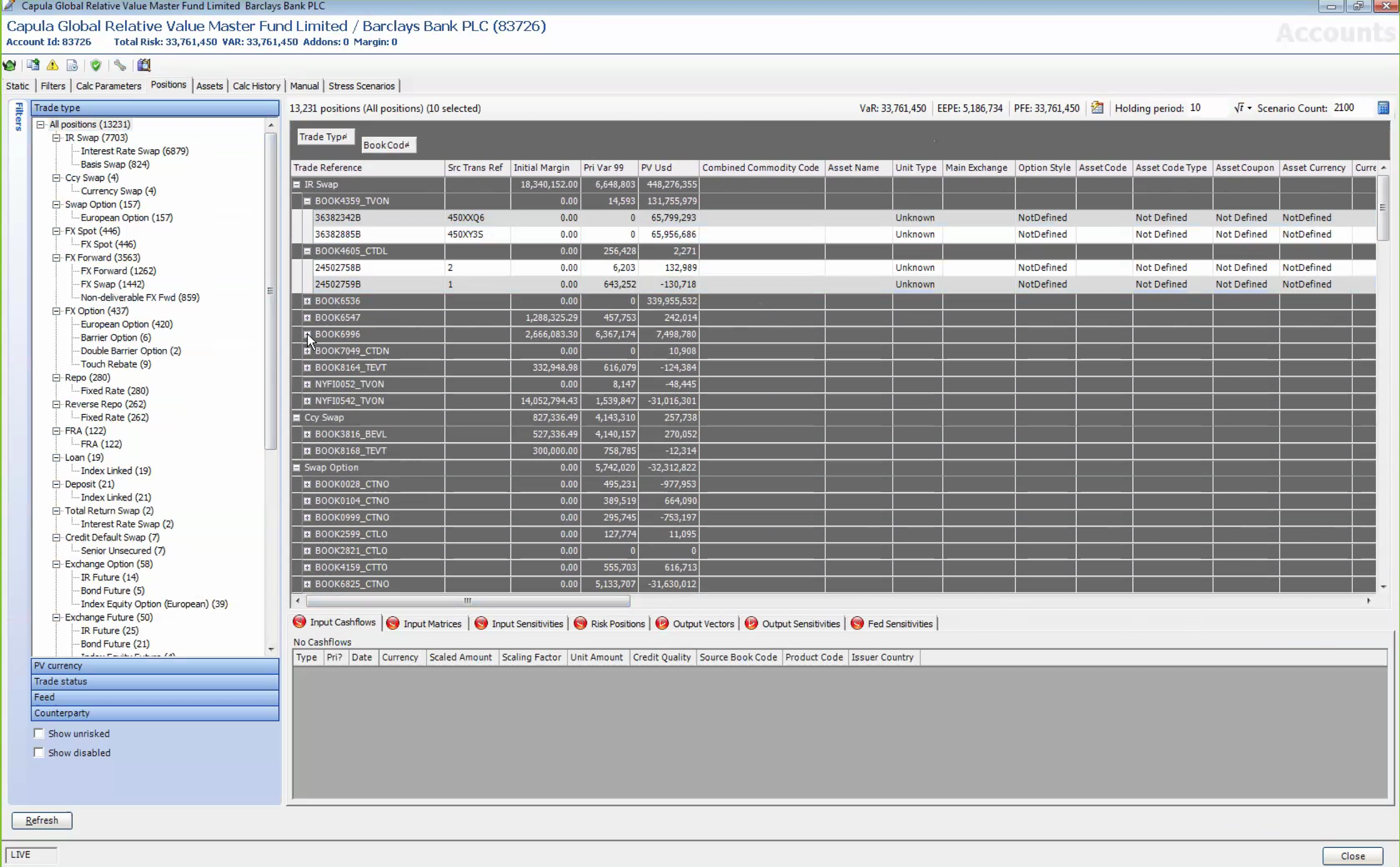
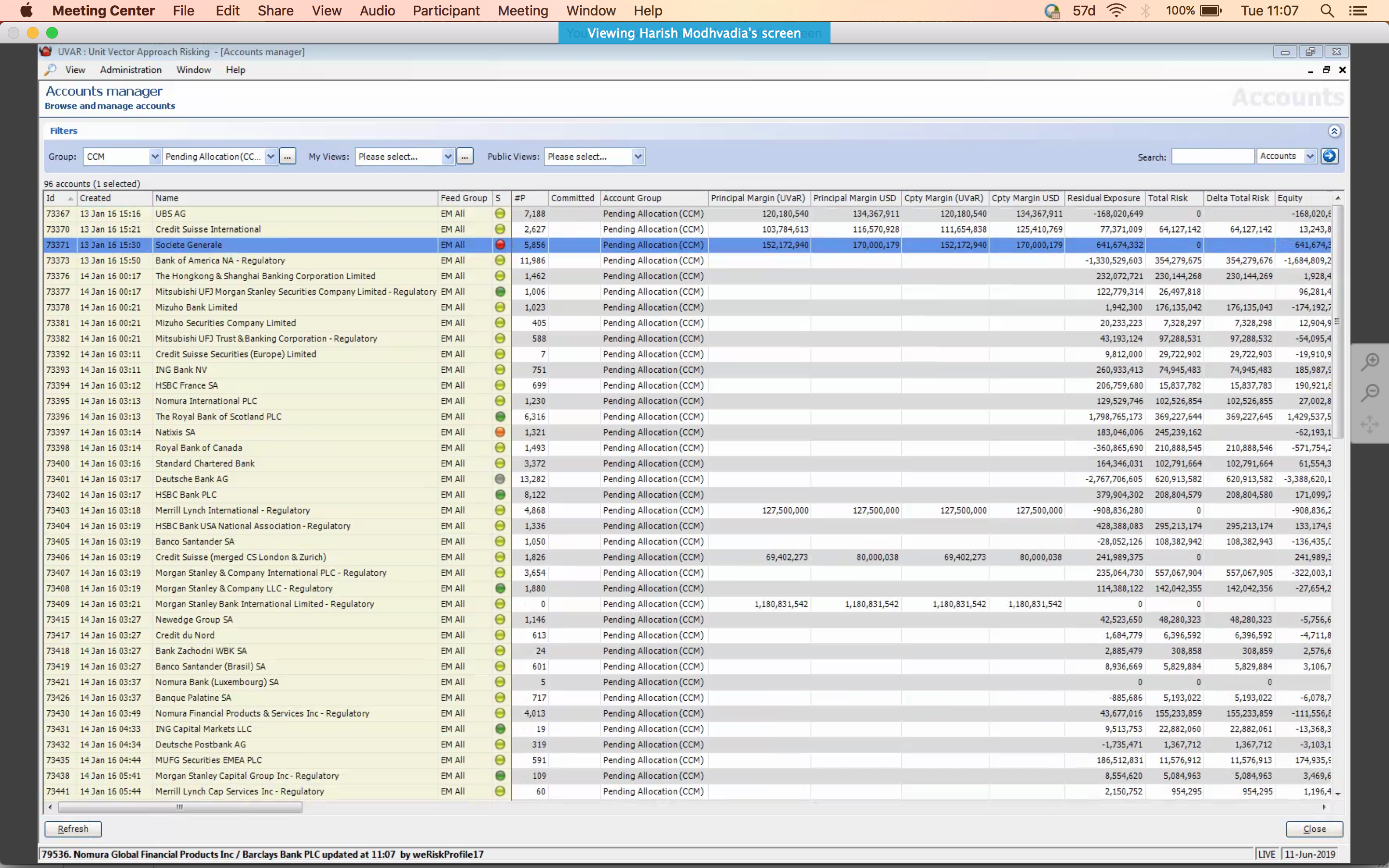
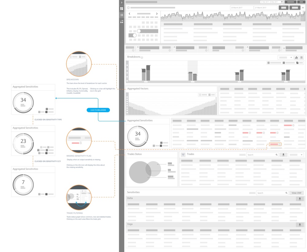
Barclays set out to modernize its margin-trading application—an internal and advanced-investor tool displaying large volumes of data. The existing interface surfaced massive information but lacked clarity, visual hierarchy, and consistency across screens.
Approach
Discovery & Analysis
The first step was to understand the needs of traders, analysts, and managers. The core challenge was to simplify an extremely dense interface while preserving quick access to critical data within very limited screen real estate.
The discovery phase highlighted:
-
Areas with high cognitive load
-
Fragmented or inconsistent workflows
-
Risk alerts that were difficult to interpret
-
Misaligned visual patterns and UI inconsistencies
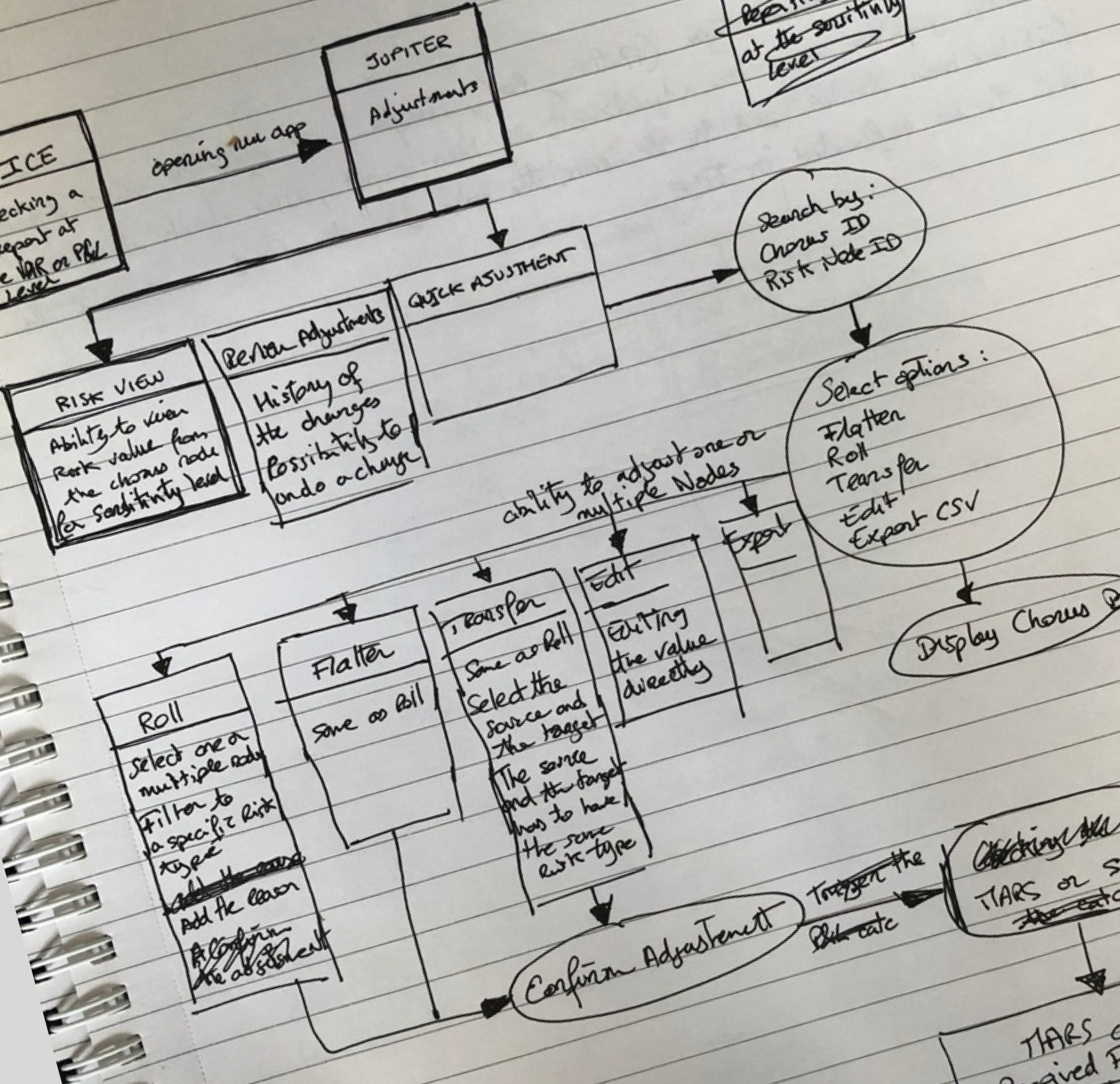
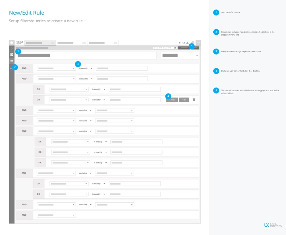
Sketches & Wireframes
To accelerate decision-making, I produced early sketches and wireframes to:
-
Clarify overall screen structures
-
Redefine key interactions
-
Simplify access to essential data
-
Test multiple patterns for data representation
These early iterations enabled fast feedback loops and allowed us to refine user journeys before moving into visual design.
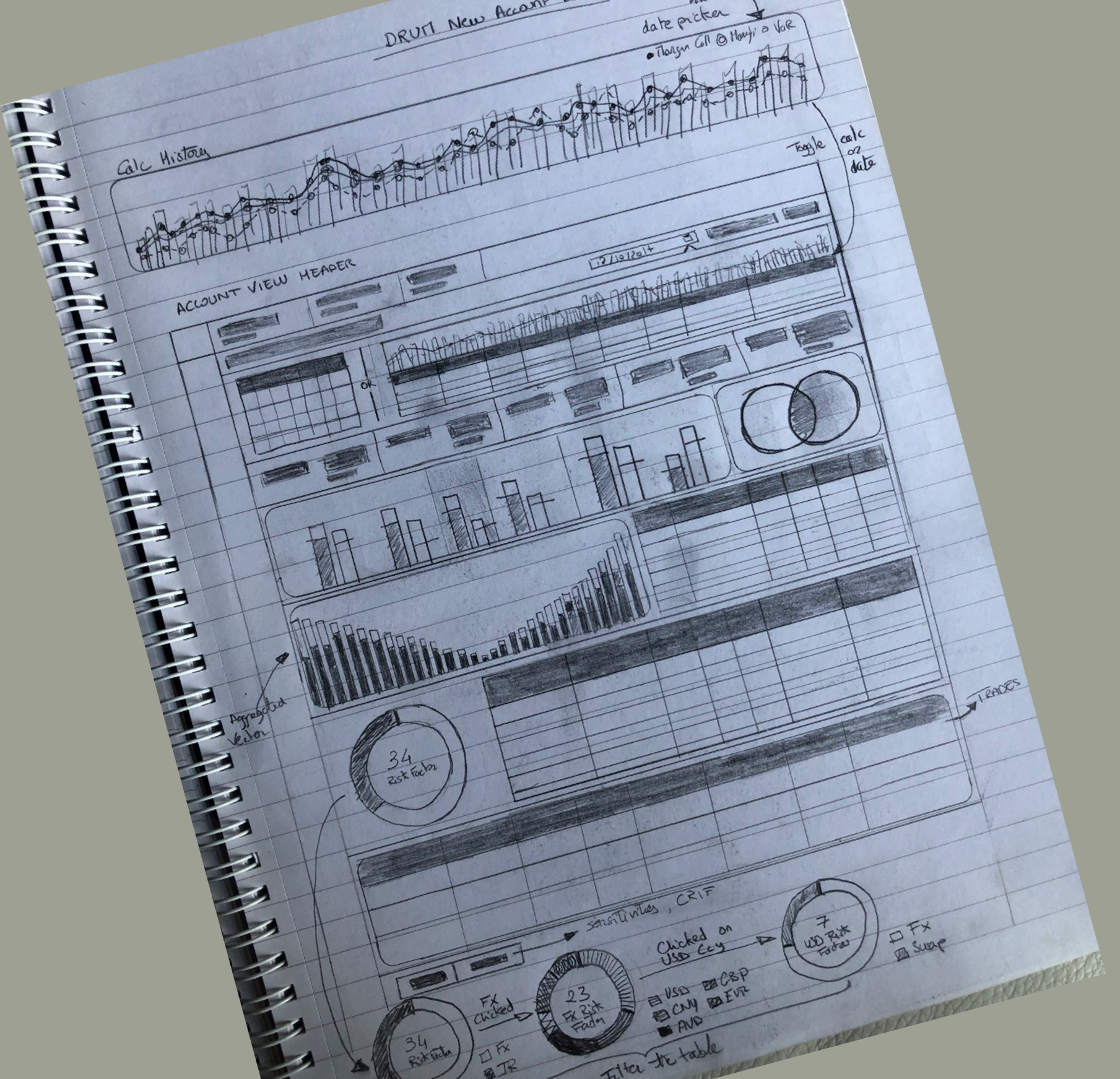
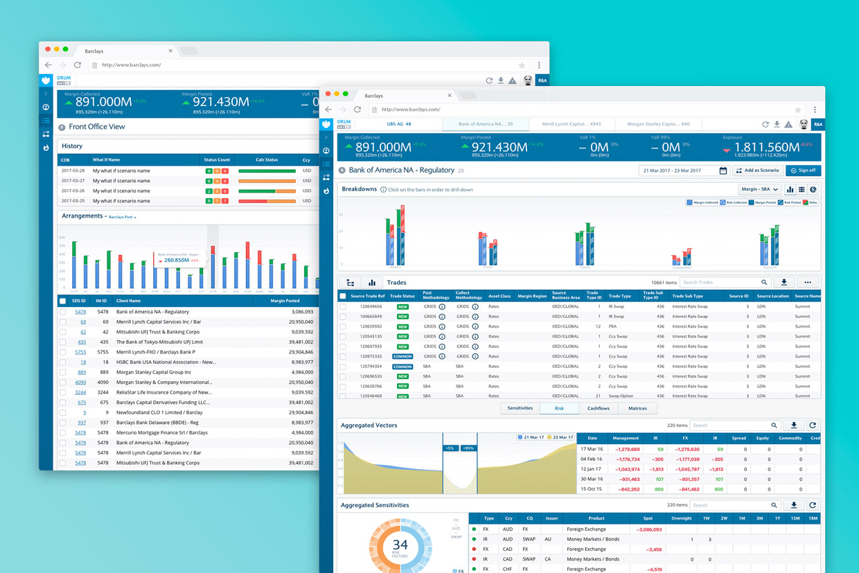
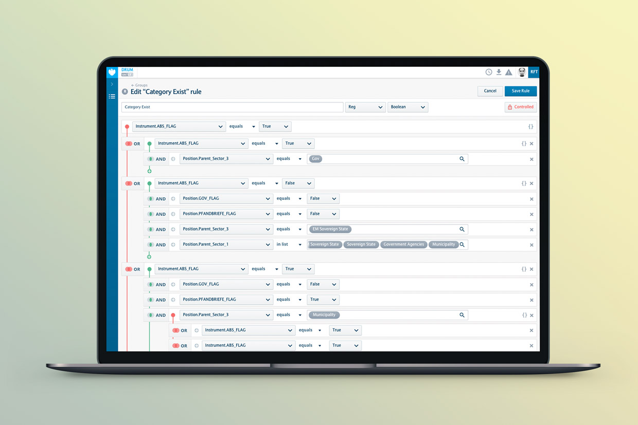
Design UI & Data Visualization
The UI work focused on:
-
A clear hierarchy to distinguish primary from secondary data
-
Controlled use of color to avoid visual overload
-
Re-architected tables to improve data comparison
-
Enhanced visibility for risk indicators (color cues, badges, pictograms)
-
Streamlined navigation to reduce repetitive actions
The outcome: a more modern interface, better structured, and significantly stronger in terms of cognitive performance.
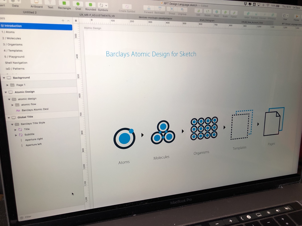
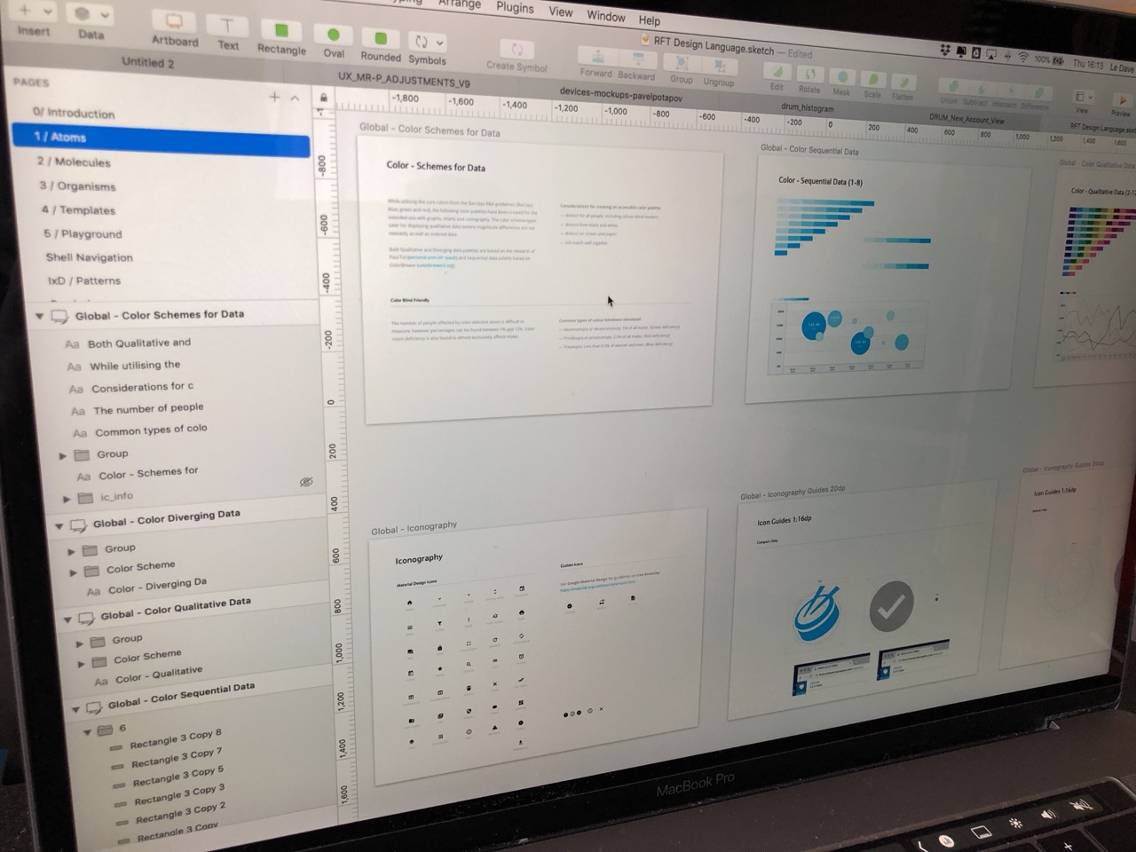
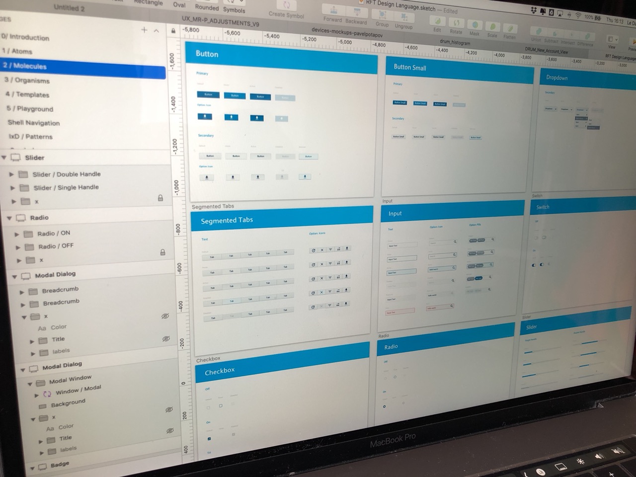
Design System
Given the variety of data displayed, a robust and modular design system became essential to ensure coherence, scalability, and visual clarity across the application.
Core elements included:
-
A color palette optimized for readability and risk signaling
-
Tokens for typography, spacing, shadows, and radii
-
Atomic components: buttons, inputs, menus, tags, badges
-
Complex components: tables, charts, data cards, action panels
-
Extended states: hover, active, disabled, loading, risk alerts
-
Full developer documentation with usage rules and design guidelines
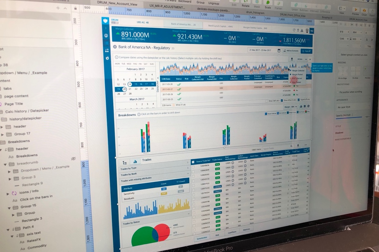
Implementation
Close collaboration with the front-end teams ensured a smooth delivery:
-
Detailed handoff and fully documented components
-
Rapid adjustments through short iteration cycles
-
Systematic visual-fidelity checks during integration
-
UI refinements based on technical constraints discovered along the way
This workflow helped deliver an implementation faithful to the original design intent.

Impact
While specific metrics remain confidential, the observed outcomes include:
-
Significant improvement in trading-data readability
-
Reduced time to perform key actions
-
Clearer risk interpretation thanks to a refined visual signaling system
-
Rapid adoption of the design system by internal teams
-
Restored product coherence after years of technical debt accumulation