

Role: Lead UX/UI Designer | 2017 → 2019
Barclays | Risk Management Platform
Responsibilities:
Design of user flows, wireframes, high-fidelity mockups, and prototypes to unify multiple legacy applications into a single risk-management platform.
Context:
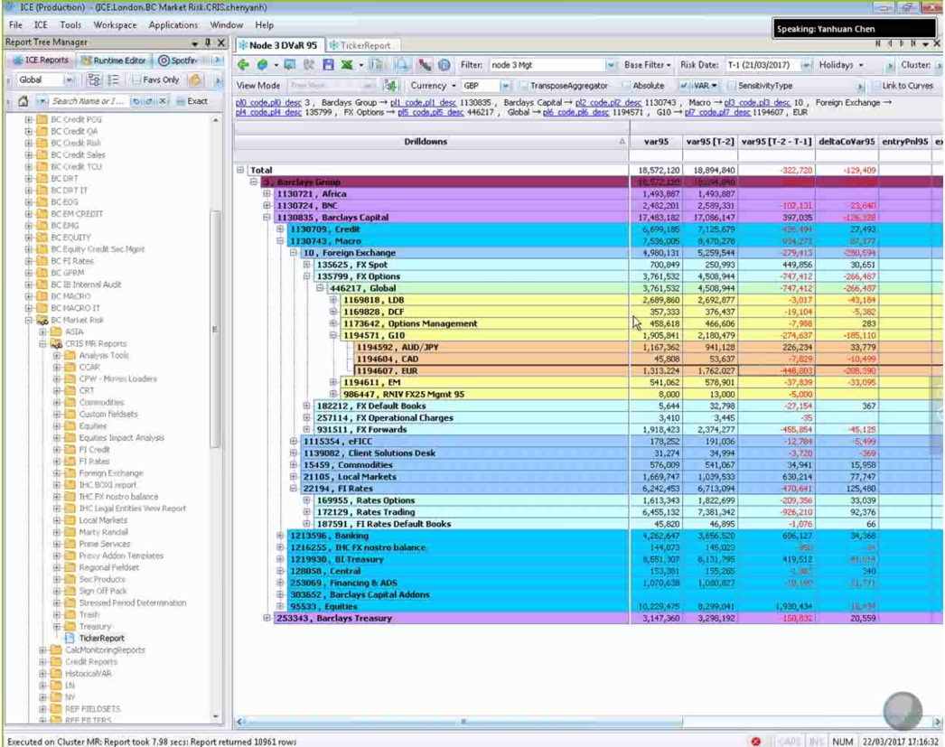
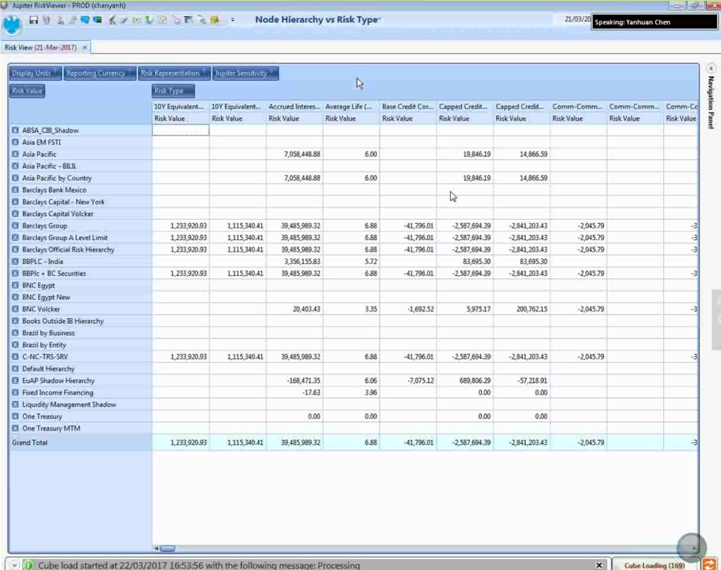
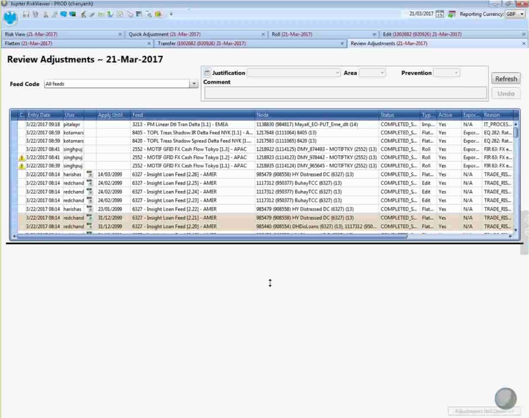
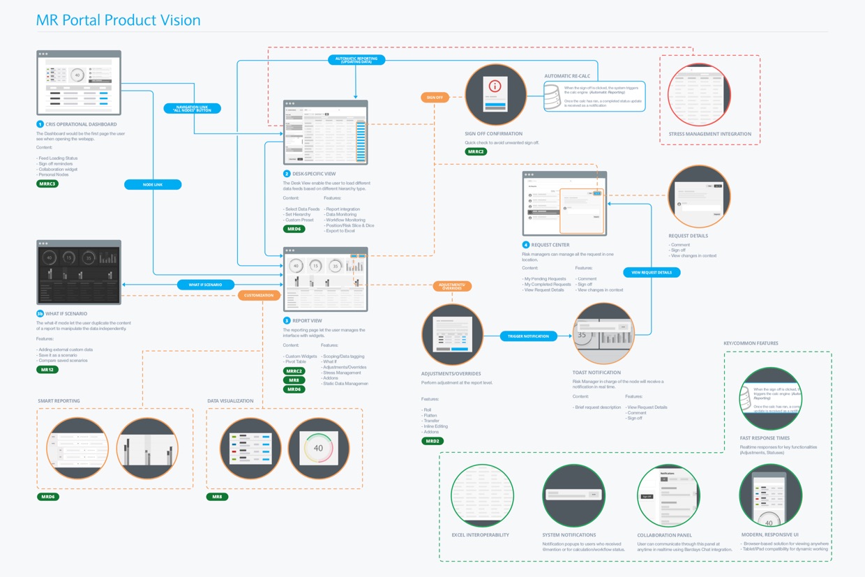
Users previously had to switch between several tools to monitor, analyze, and manage risks—leading to fragmented workflows and repetitive tasks. The goal was to centralize key capabilities into one clear, efficient interface that streamlined their daily work.
Approache
Discovery & Analysis
I conducted user interviews to understand their context, constraints, and pain points.
Live demos of existing applications made it possible to:
-
Identify friction points across workflows
-
Highlight repetitive tasks and back-and-forth navigation
-
Clarify the core needs that the new platform should address
These insights shaped the target workflows and the initial feature set.
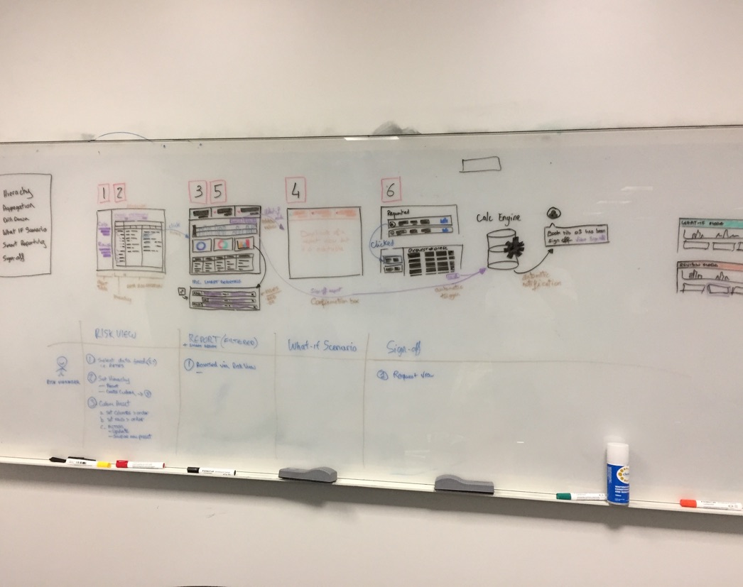
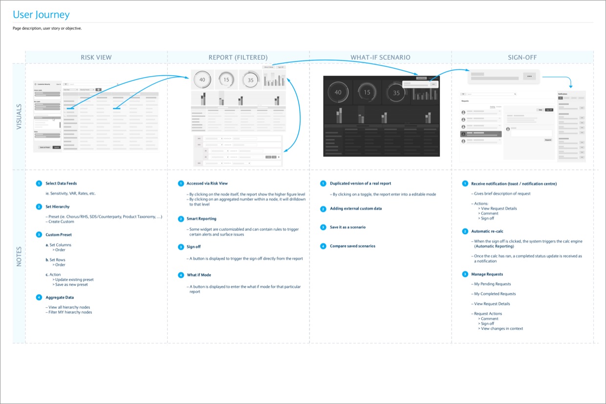
Sketching & Flow Mapping
Using the research as a foundation, I created early sketches and user flows to visualize end-to-end processes and validate them with users.
These sketches helped us quickly compare approaches and select the most effective ones before moving into structured wireframes.

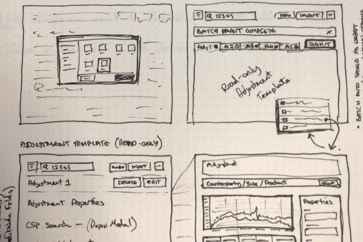
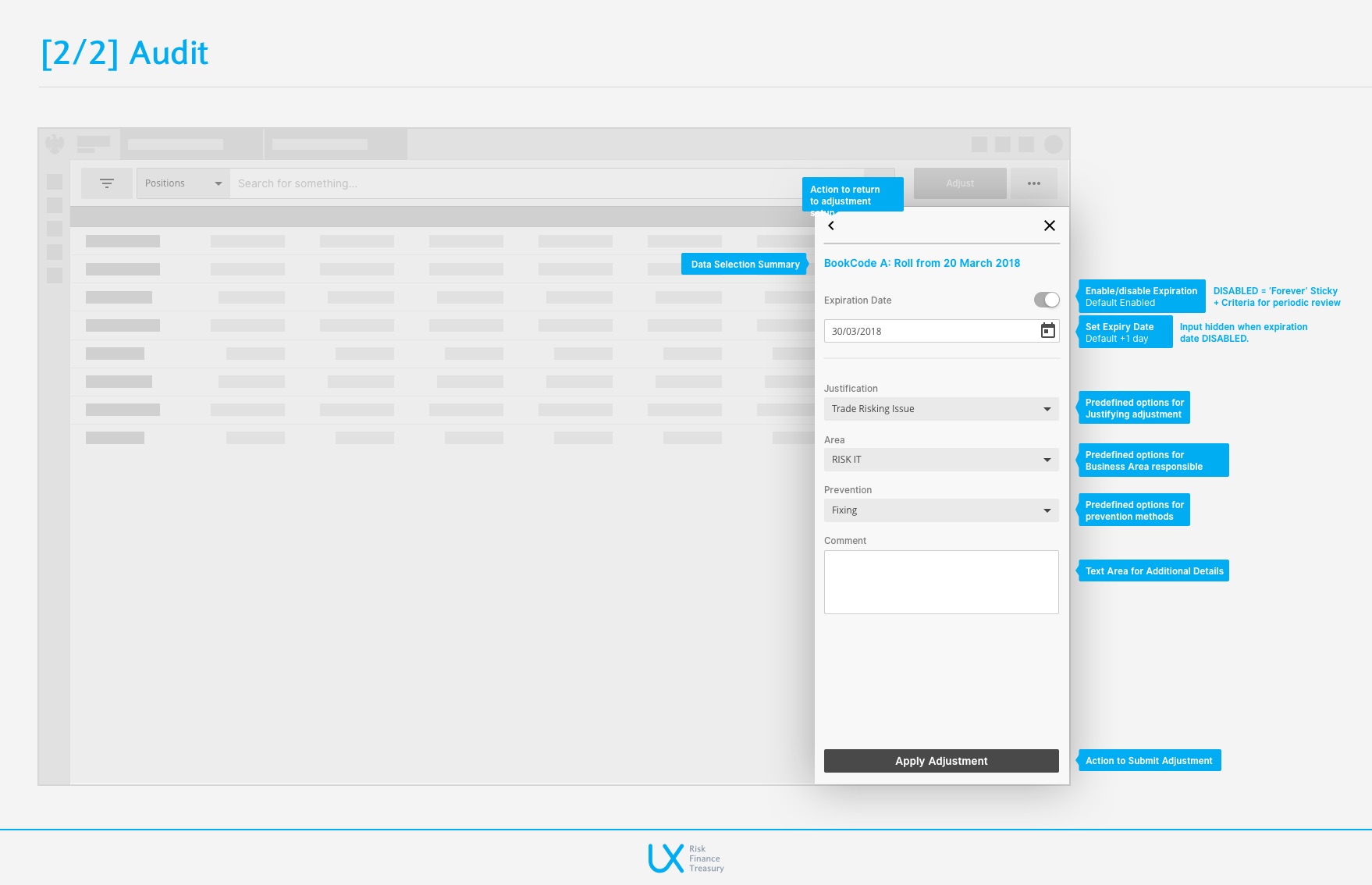
Wireframes
Wireframes were developed to:
-
Establish the structural layout of key screens
-
Explore multiple layout and interaction ideas
-
Capture early feedback prior to investing in visual design
The focus was to ensure the platform genuinely simplified daily workflows before refining UI details.
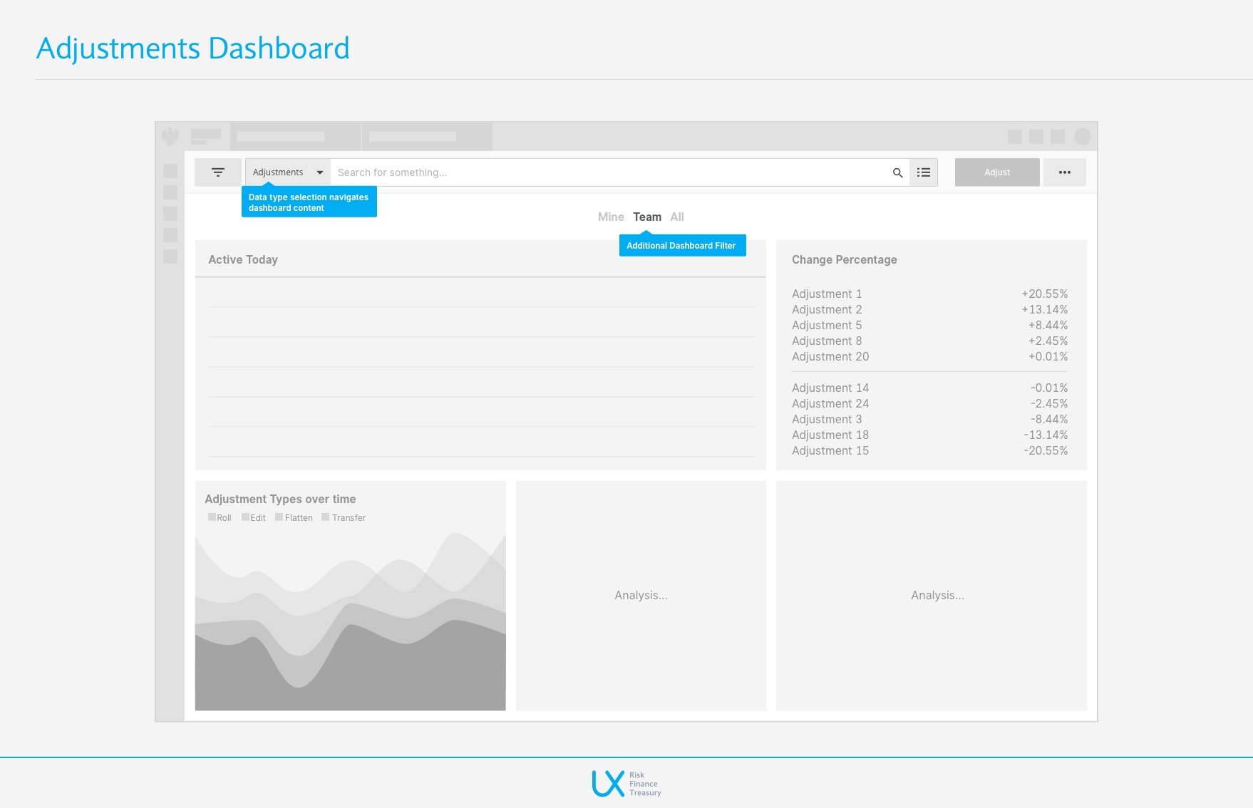
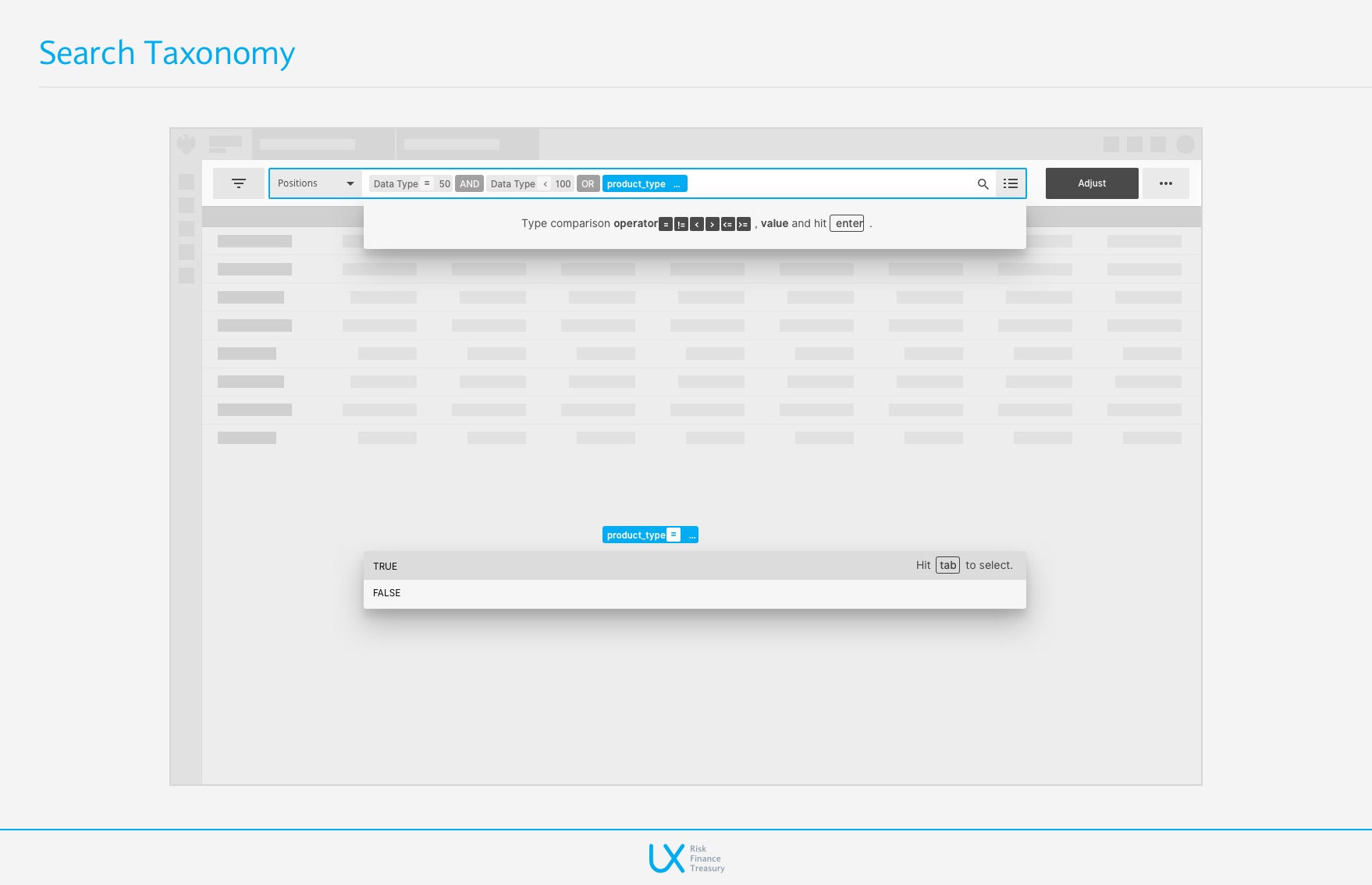
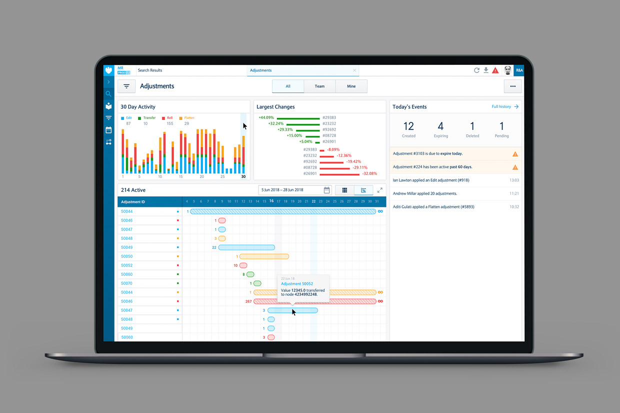
Design UI & Data Visualization
The visual design process focused on:
-
Strengthening information hierarchy
-
Structuring screens around key steps in each user journey
-
Making primary actions more accessible
-
Reducing perceived complexity around sensitive risk-related data
High-fidelity mockups then informed the prototypes used for usability testing.
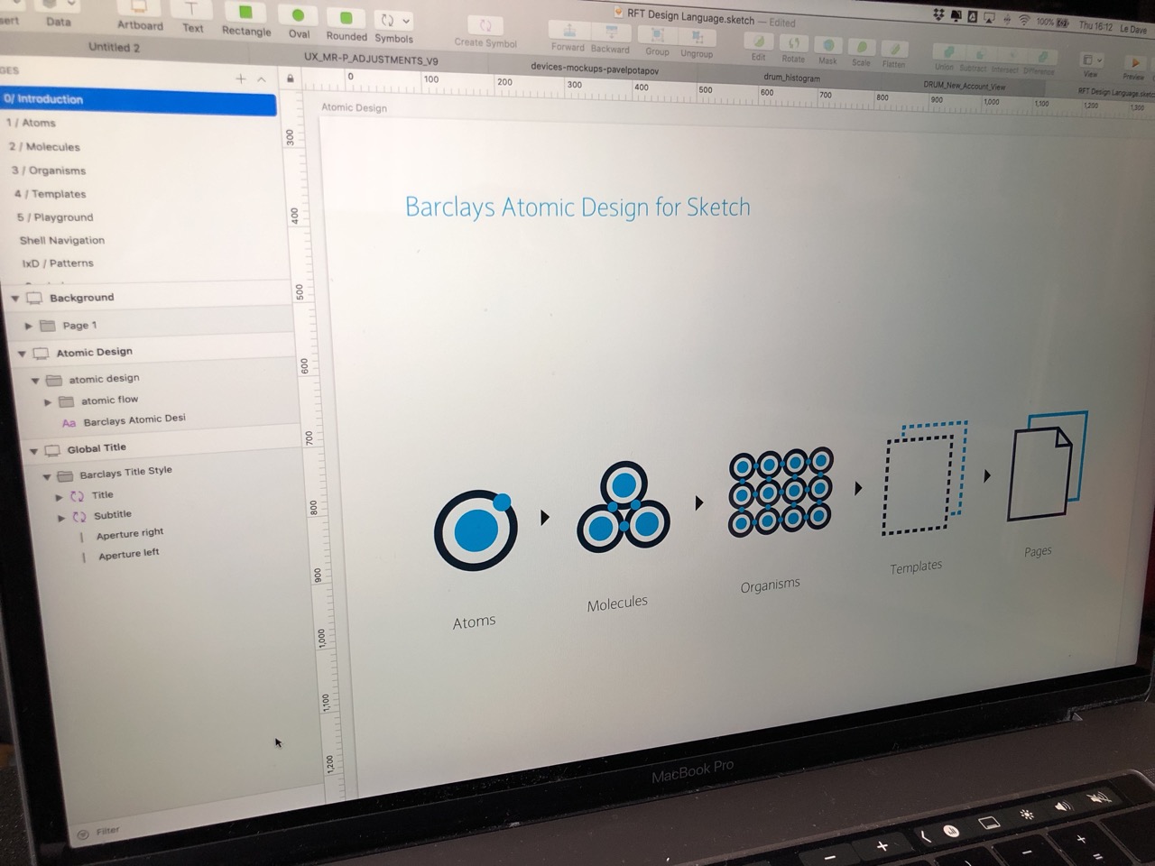
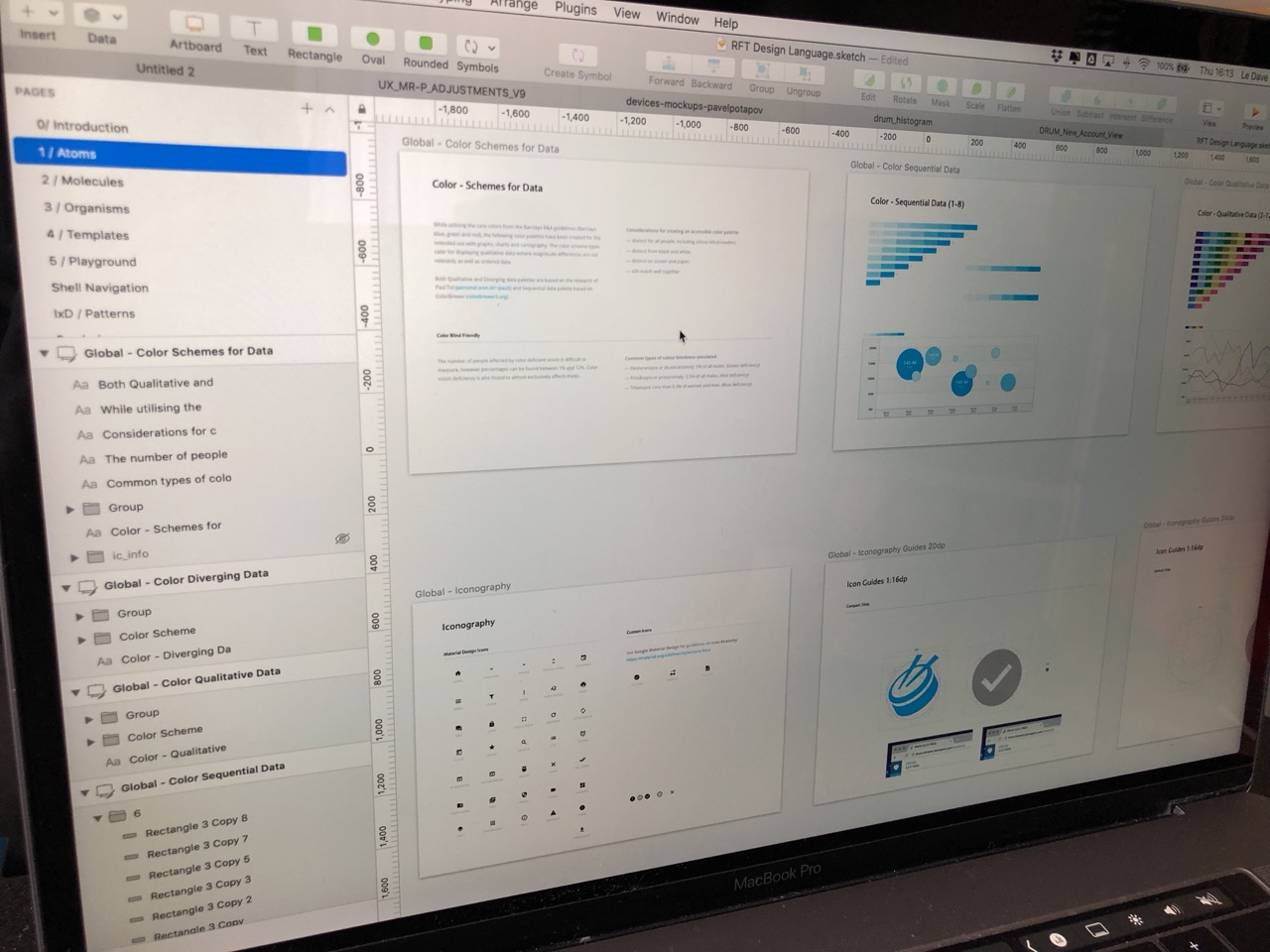
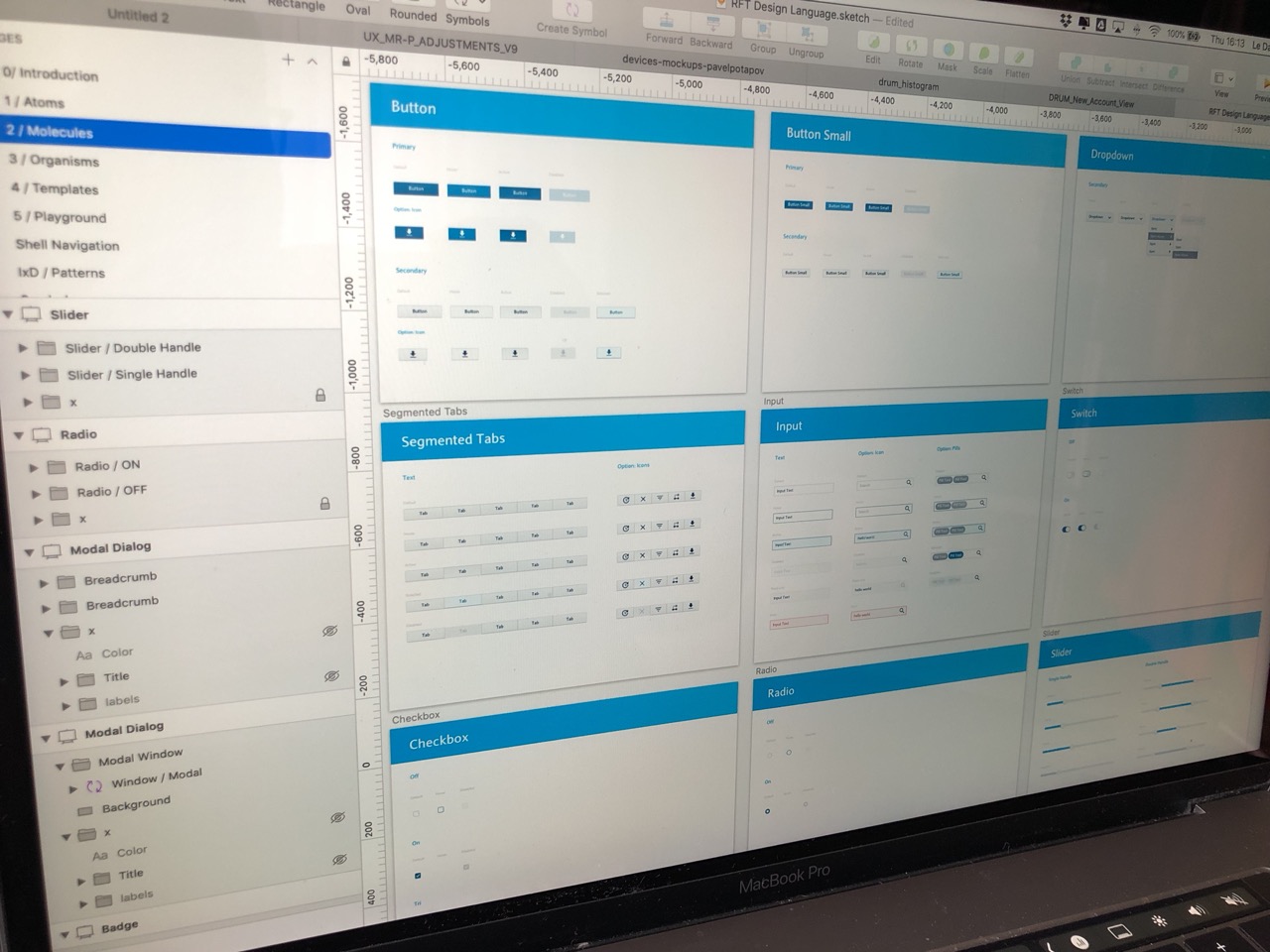
Design System
Given the diversity of data and components, a robust, modular design system was essential to maintain coherence and scalability across the platform.
Key Elements:
-
A color palette optimized for clarity and risk signaling
-
Tokens for typography, spacing, shadows, and radii
-
Atomic components: buttons, inputs, menus, tags, badges
-
Complex components: tables, charts, data cards, action panels
-
Extended states: hover, active, disabled, loading, risk alerts
-
Complete developer documentation with usage rules and guidelines
Implementation
Collaboration with front-end engineers was continuous:
-
Detailed handoff with fully documented components
-
Fast iteration cycles to address feedback
-
Visual-fidelity checks during integration
-
UI adjustments based on technical constraints discovered along the way
This ensured a smooth delivery and a final product aligned with the original design intent.

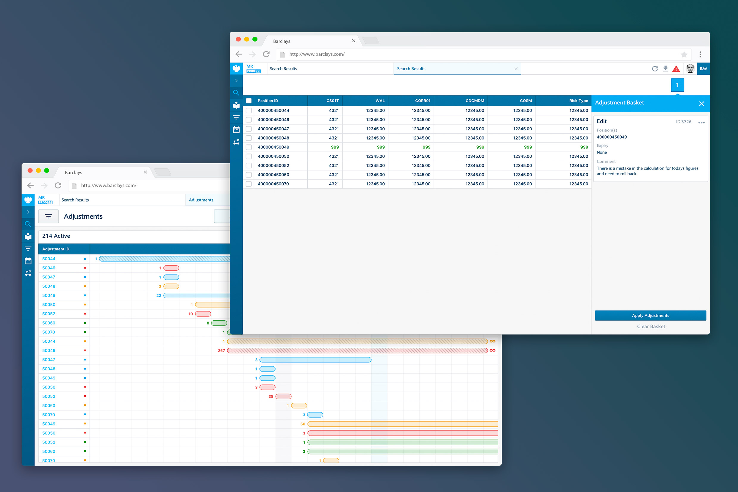
Impact
The new risk-management platform enables:
-
Centralization of features previously scattered across multiple tools
-
Simplified workflows and reduced cognitive load
-
A more coherent environment tailored to users’ daily needs
By consolidating everything into a single platform, users now gain clarity and efficiency in their risk-monitoring and analysis tasks.