

Role: Lead Product Designer | 2020 → 2023
Air France Mobile App | E-commerce
Responsibilities:
High-fidelity UI redesign and interactive prototype for testing & validation • Creation of the mobile design system • Close collaboration with CX, product, and iOS/Android teams to ensure implementation quality and cross-platform consistency.
Context:
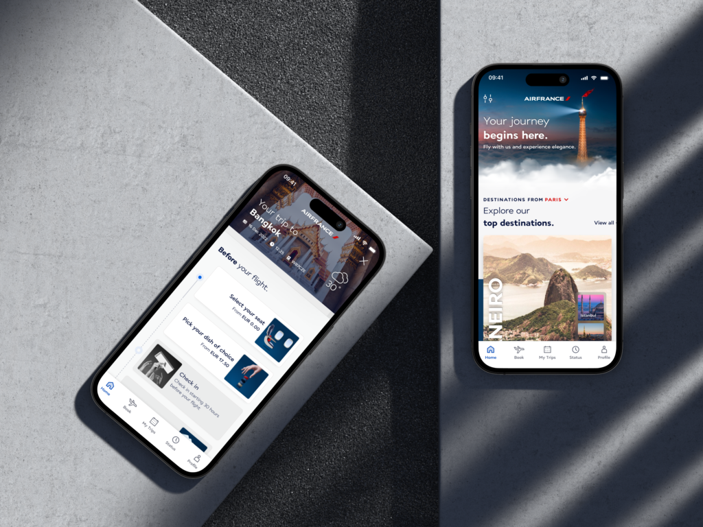
After the merger of the Air France and KLM mobile apps, the challenge was to create a unified and modern interface while preserving the distinct identity of each brand. The Air France app needed to embody its new premium positioning.
The previous interface was dated, visually unstructured, and lacking a coherent UX—no longer met expectations, especially for premium members and leisure travelers seeking an elegant, seamless experience.
Approach
High-Fidelity Prototype
During the Design Sprint, I designed the interface (starting from sketches) and built a high-fidelity prototype in Protopie to achieve near-real application behavior, something not possible with Figma at the time.
Beyond usability testing, the prototype played a key strategic role: helping stakeholders and leadership visualize and endorse a radically updated design direction.
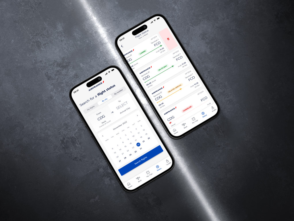
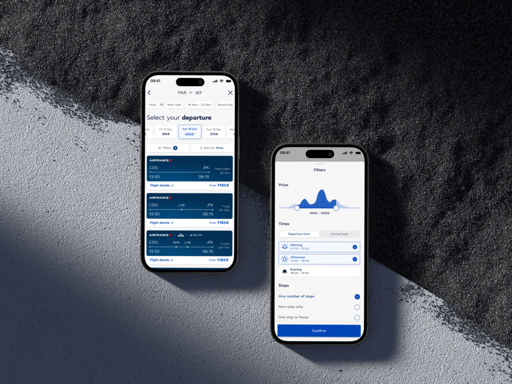
Modernazing the Global Experience
The entire interface was rethought to become more premium, accessible, and visually coherent. Key improvements included:
-
Reducing the overuse of red to avoid constant “alert-state” perception
-
Redefined color palette, typography, spacing, and structural rules
-
Clearer visual hierarchy for easier navigation
-
Unification of UI patterns inherited from both legacy apps
Before redesign

After redesign
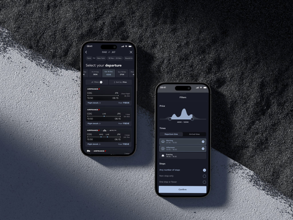
Introduction of Dark Mode
I designed the app’s first dark mode, focused on visual comfort, contrast, and a premium expression of the refreshed identity.

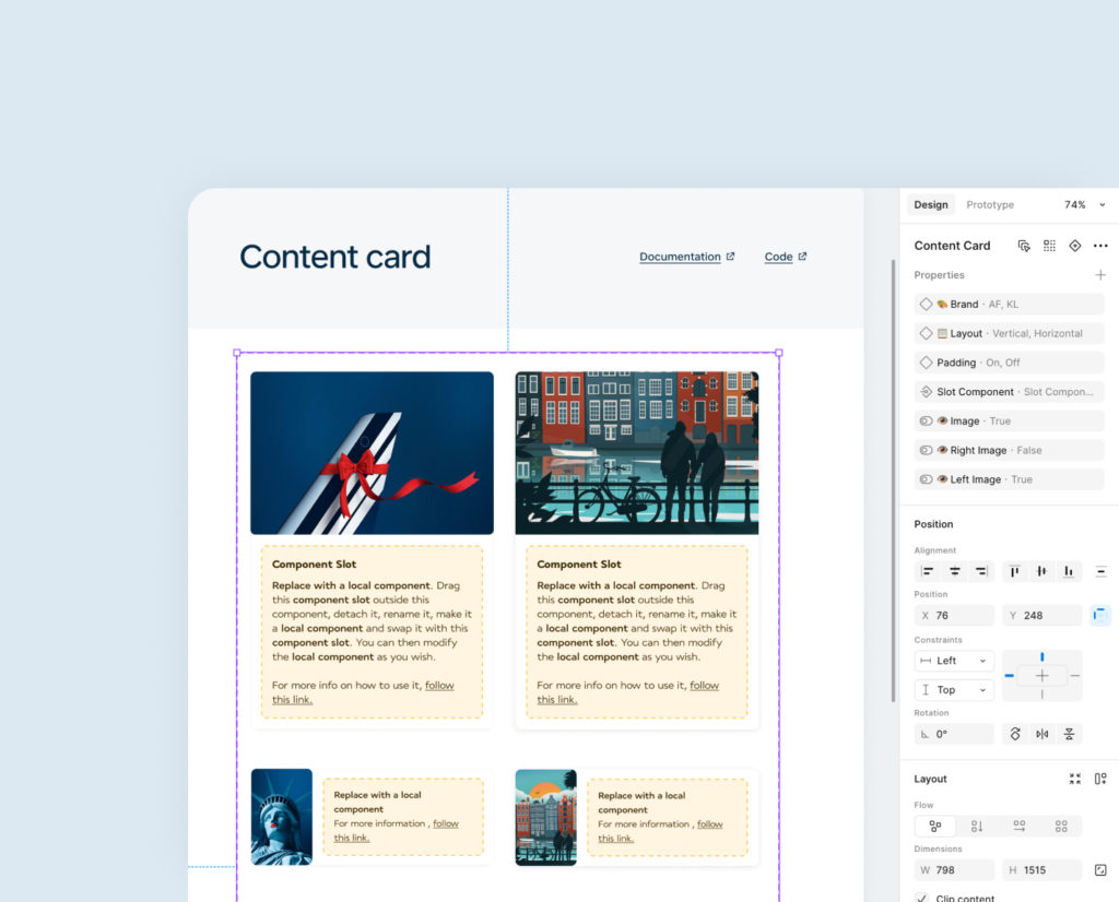
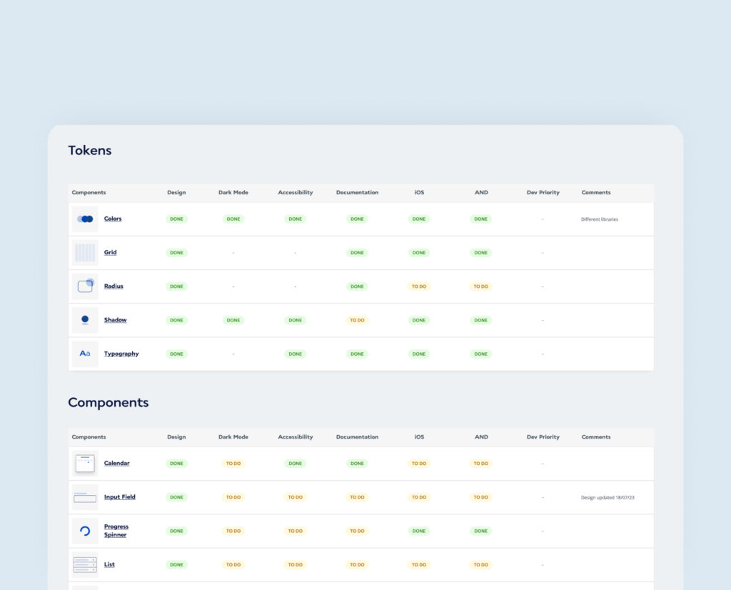
Design System
We created a complete mobile design system in Figma, including:
-
Color and typography tokens
-
Component libraries with interaction states
-
Layout and spacing rules
-
Accessibility integrated into every component
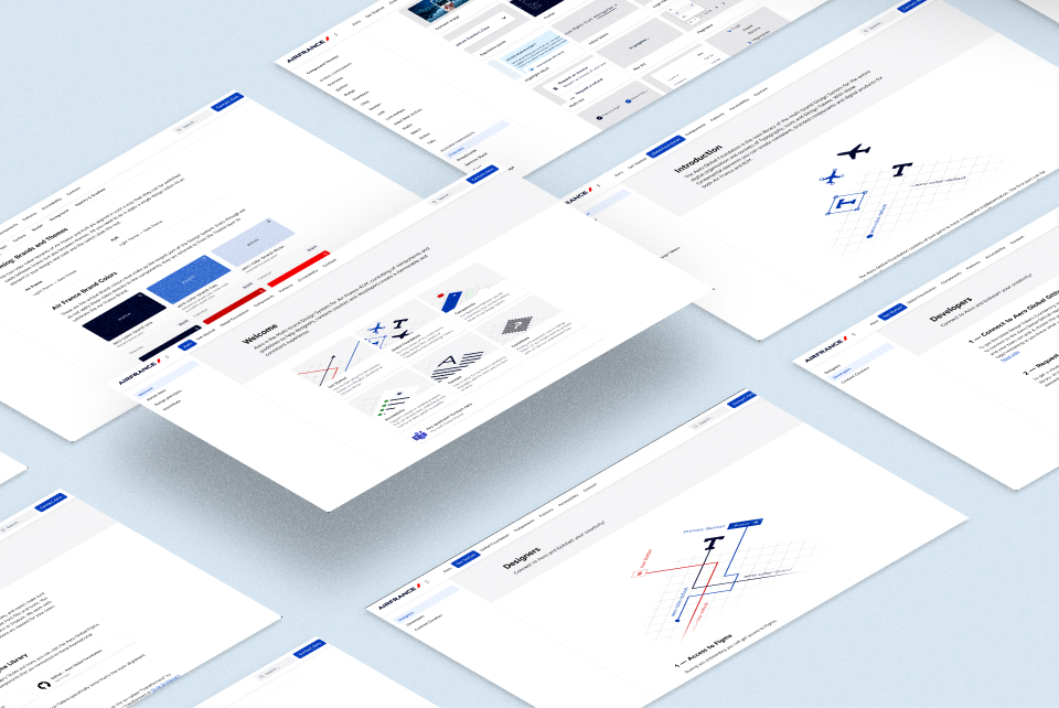
The system was structured to streamline engineering workflows, supported by clear documentation in Zeroheight and Storybook, as well as a shared roadmap for component delivery.
Impact
Key Results
-
A modern, premium interface aligned with the brand’s new identity
-
Stronger usability through improved hierarchy and accessibility
-
Faster development cycles enabled by a shared design system
-
Greater consistency between the previously separate applications
-
User-validated designs, including among high-value traveler segments
-
Post-launch: a 25% increase in user engagement and retention